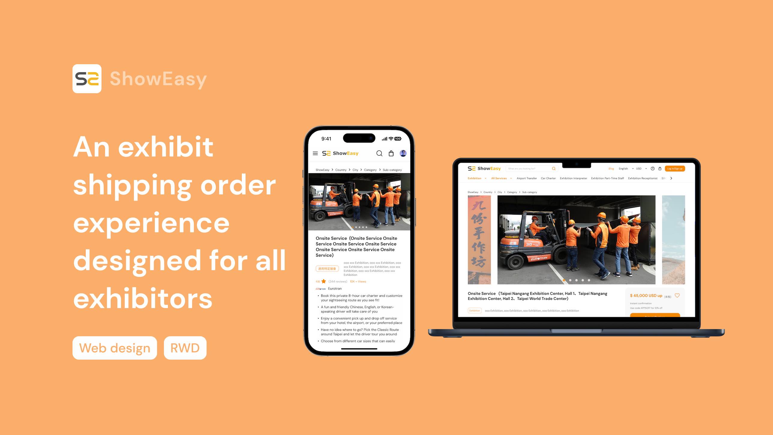
An exhibit shipping order experience designed for all exhibitors
As the sole designer on the team, I designed an exhibit shipping order experience for ShowEasy, a Taiwanese e-commerce platform that offers a range of trade show services. Between October and December 2022, my team and I successfully launched an MVP.
100+
Pages
60
Duration (day)
2022
Year
Background
Exhibit shipping services are difficult to integrate into the existing ordering process.
Participating in exhibitions is crucial for many brands, as it can lead to potential collaboration opportunities and greater exposure for the brand. However, for small and medium-sized enterprises, participating in exhibitions is often a challenging task. It requires significant effort and preparation, such as planning the exhibition booth and arranging exhibit transportation.
To address these challenges, ShowEasy has developed an e-commerce platform that offers specialized services to global exhibitors. However, during our negotiations with partners, we discovered that the process of ordering exhibit transportation services was highly complex and challenging to integrate into the existing ordering process. As a result, we decided to create a customized ordering process specifically for this service.

Web Design (RWD)
ShowEasy
Function planning, UX process planning, UI design, UX writing, Design deliver
Goal
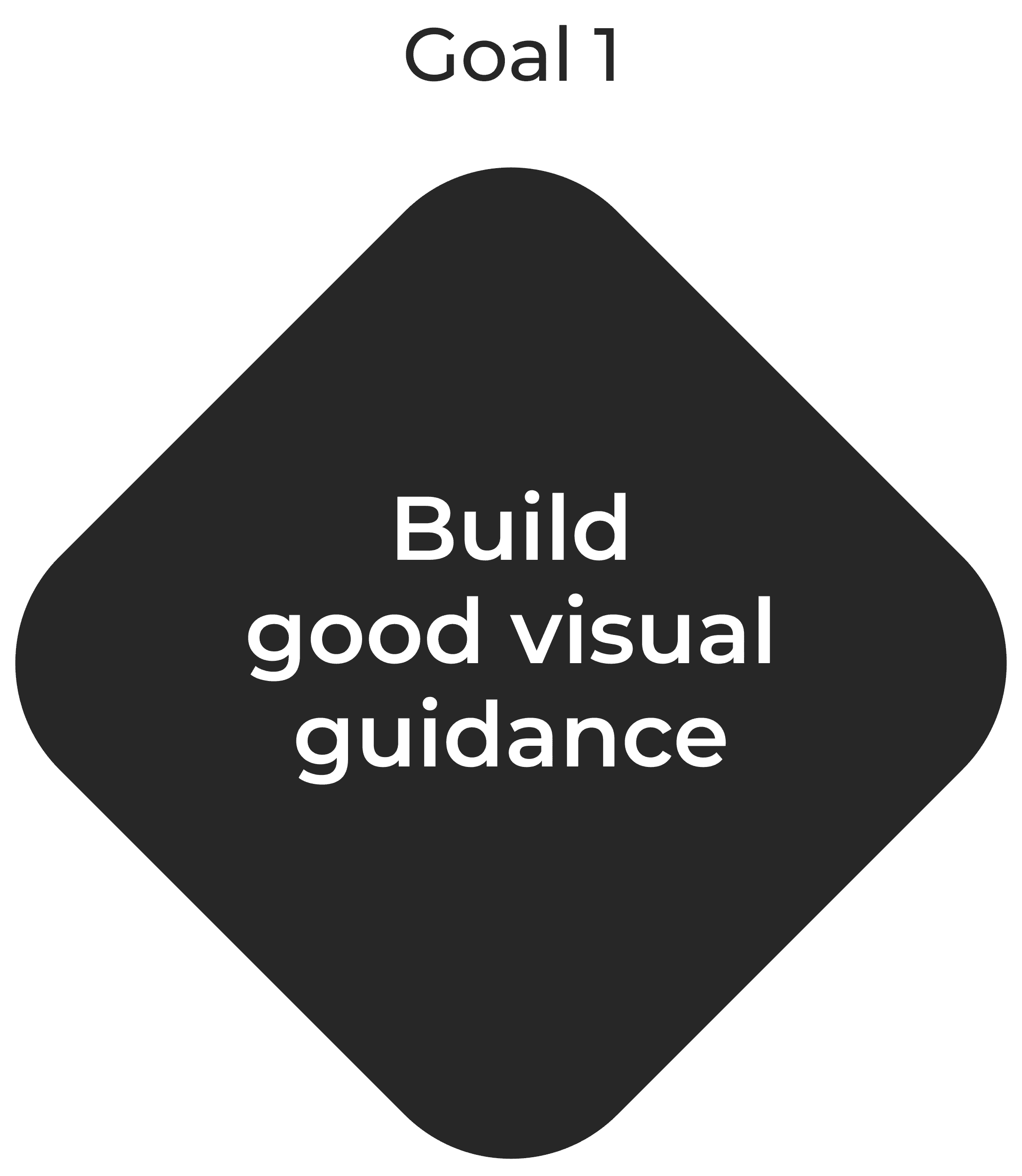
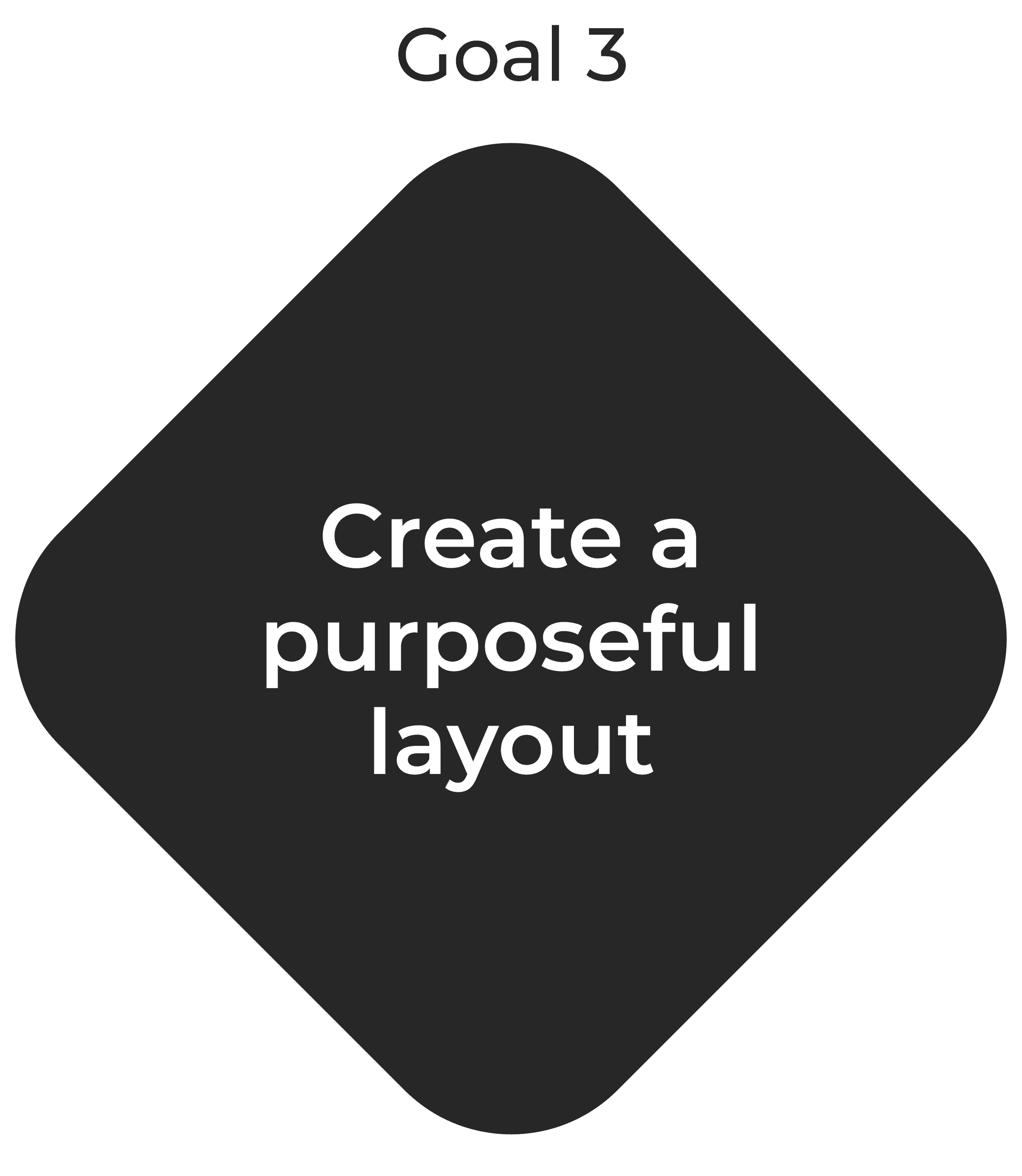
Redesign an exhibit shipping order experience through ShowEasy’s design guideline.
Design a seamless user experience and interface by a clear UX writing, design patterns.
Build an MVP in 2.5 months with PM and engineers.
Challenge
Limited resources: Startups often face limitations in time and finances that can make research difficult.
Complexity order process: The ordering process is complicated due to the highly customized services they offer.
Low design maturity: Designers in the product development team have limited decision-making power.
Impact & Results
We successfully launched an MVP in only two months.
Deliver a high feasibility design solution through co-working with engineers.
Build trusting stakeholder relationships through efficient design handoff and process.
Design Process
Research, Define, and Design.
In order to optimize my design process, I decided to streamline it by breaking it down into three phases: Research, Definition, and Design.
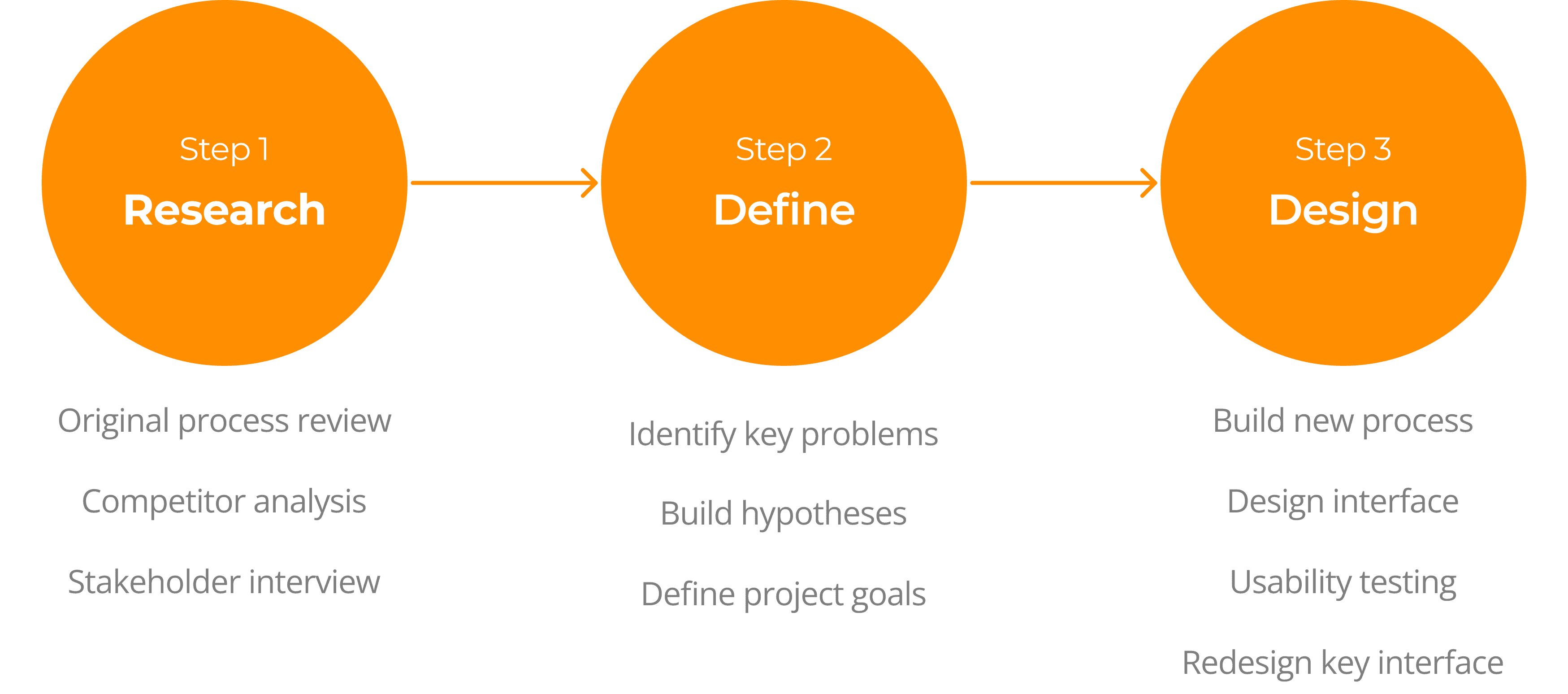
01 Research
Initially, I reviewed the original process to get a better understanding of how it works. After that, I analyzed the processes of my competitors to gather valuable insights on what makes a good order process.
To ensure that I make the right decisions, I conducted stakeholder interviews to understand their requirements and needs.
Original process review
How does the original order process work?
To get close to the problems that users faced, we did a desk research. After the research, we discovered some issues with our order process. Here are our findings:
🔎 To fill in the exhibits, the user needs to select the "Exhibition" first. Not all exhibit transportation services are available for all exhibitions. Therefore, users need to choose a designated exhibition before the corresponding services become available.
🔎 There are multiple ways to find exhibitions. Users don't necessarily need to know the name of the exhibition and can search by year and region.
🔎 There are several variables that affect the service prices. The cost of the service depends on the size, weight, transportation method, and other factors of the exhibits.

Competitor analysis
As a part of our market research, we conducted an analysis of our competitors to gain insights into their strengths and weaknesses. This helps us identify what constitutes a good and a bad order process.
Our findings indicate that a good order process should have these three key points:
Easy to navigate
Have a good navigation system through intuitive design.
Streamline process
Streamline checkout process for reducing abandonment rates.
Clear information
Minimize customer efforts through a good visual hierarchy.
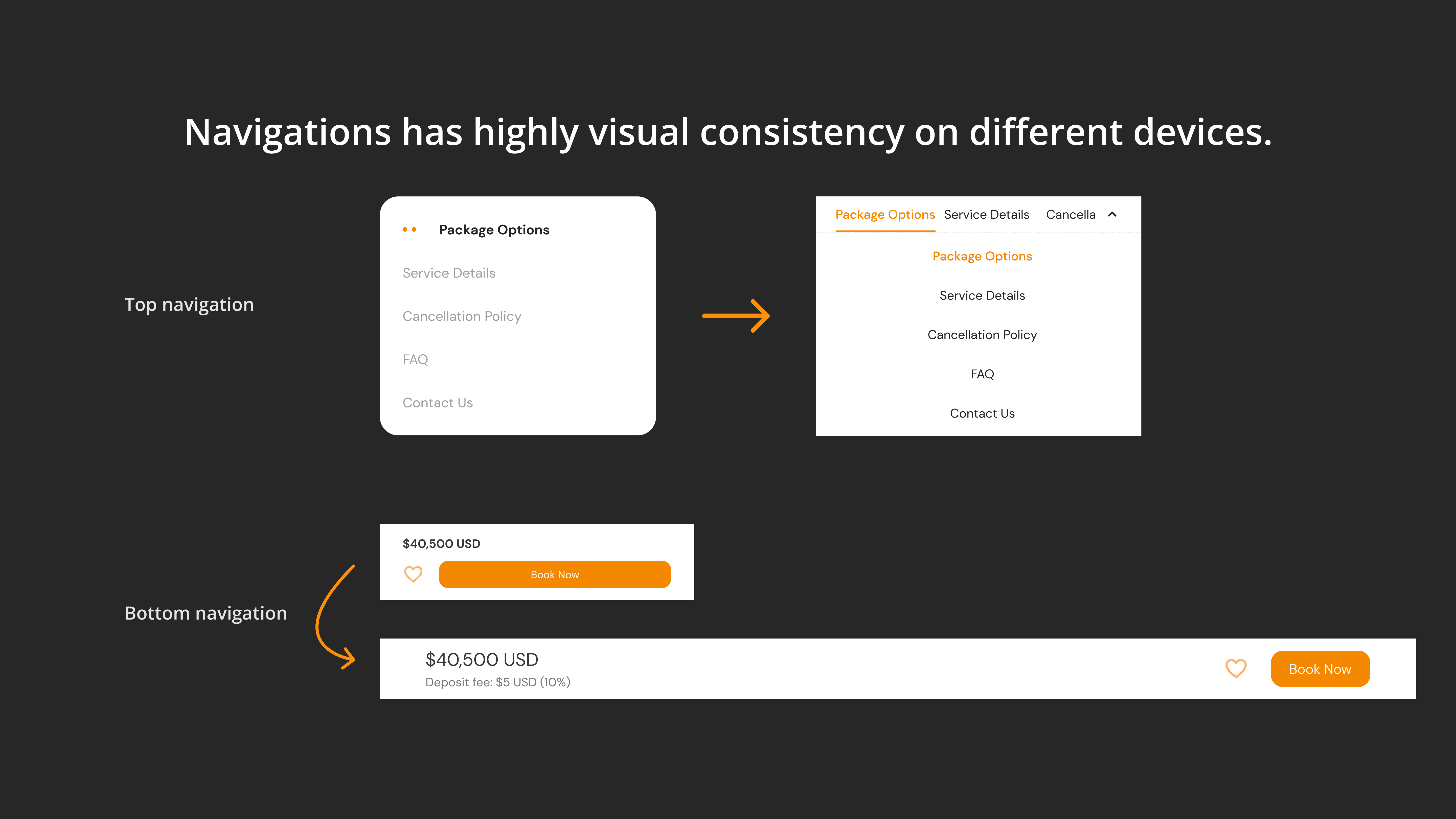
Visual consistency
Consistency helps users understand how to use the process and what to expect from it.
Common UI elements
Not be experimental and make the web easy to use.
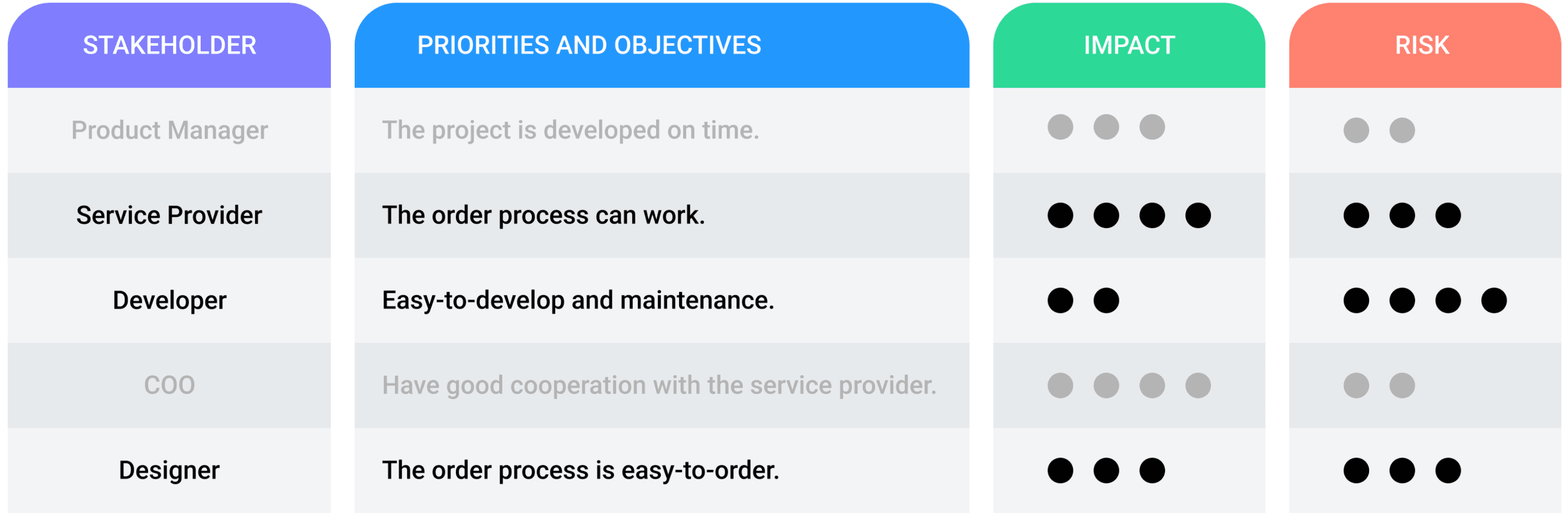
Stakeholder interview
To ensure that I make the right decisions, I conducted stakeholder interviews to understand their requirements and needs.
I created a list of major stakeholders, listing their needs, impacts, and risks. Then I prioritized the needs of the three high-risk stakeholders: service provider, developer, and designer.
02 Define
After conducting thorough research, I identified the key problems, developed a hypothesis, and established project goals.
Identify the problems in original layout
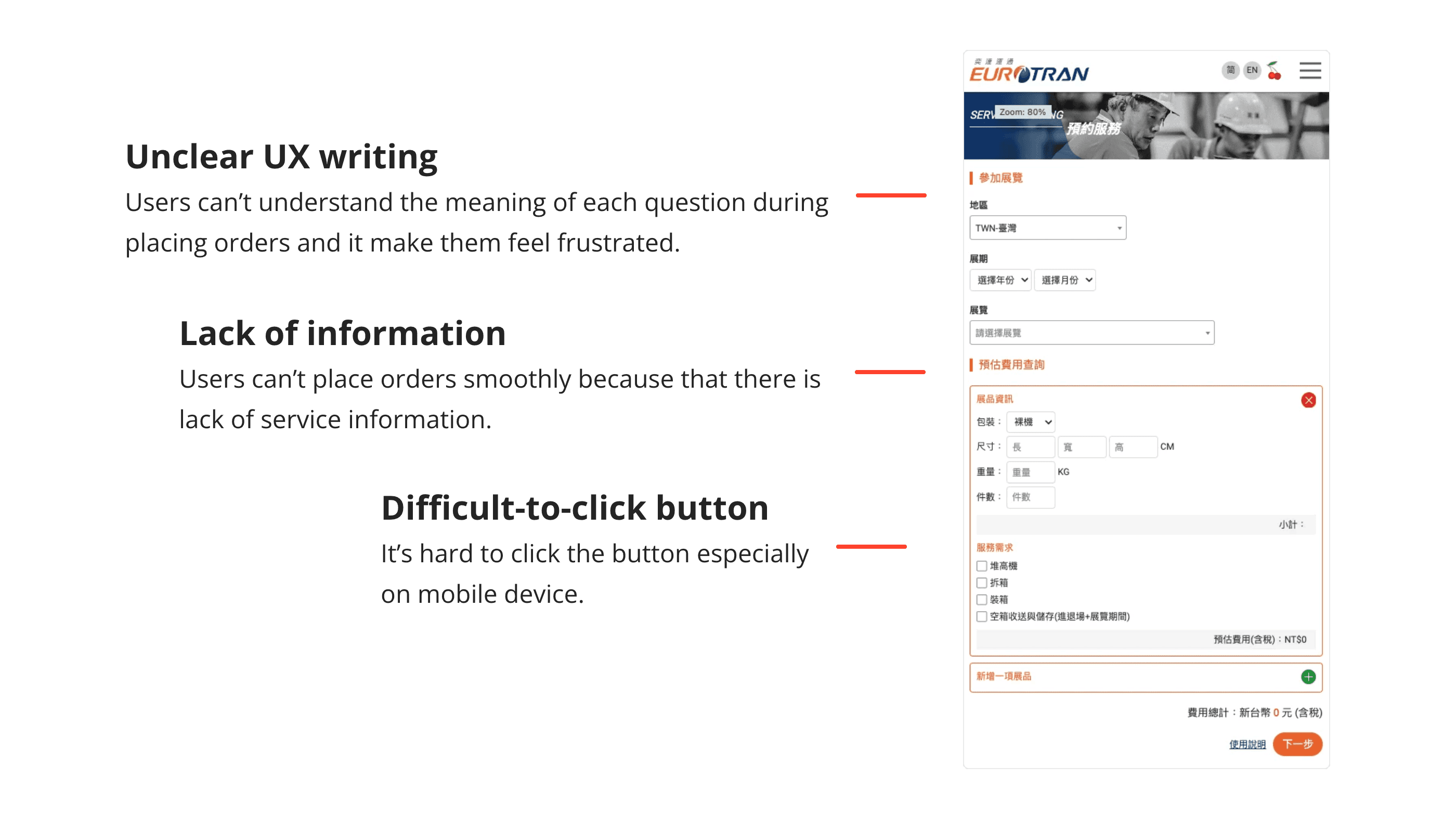
After conducting thorough research, I have identified the key problems that we are facing. The issues are listed below:

Unclear UX writing
Users can’t understand the meaning of each question during placing orders and it make them feel frustrated.

Lack of information
Users can’t place orders smoothly because that there is lack of service information.

Difficult-to-click button
It’s hard to click the button especially on mobile device.
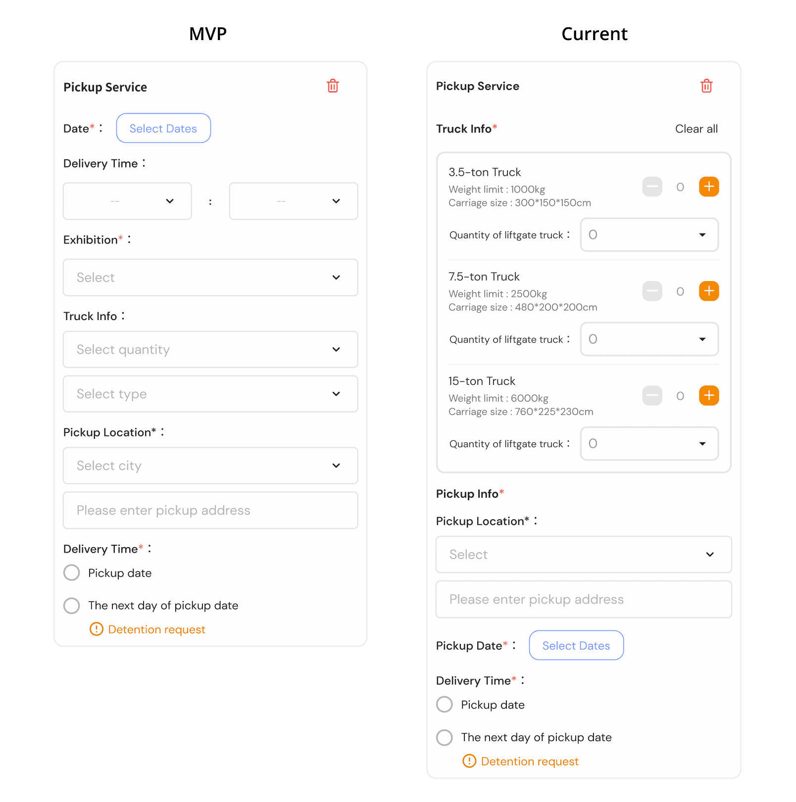
Additionally, we have a new requirement for an additional service.
We need to add a new section for truck pickup service that includes questions about date, delivery time, and exhibition.
Let’s build the hypotheses!
1
2
Define the project goals
Next, I established the project goals based on the problems and hypotheses with PM.
Our goals are…
03 Design
With the goals in mind, I began building a new exhibit shipping order process. After redesigning and testing the process, I successfully delivered my finalized design.
Build a new order process
Based on the assumptions and goals that I established earlier, I have redesigned a new ordering process after analyzing the original process.
In addition, I have incorporated a new requirement of “additional service” into the new ordering process. One of the unique features of this process is that the user can only select the purchased truck pickup service (additional service), as it is mandatory by the service provider.

Design principle
My design principles are Aesthetic, Simplicity, and Feasibility.
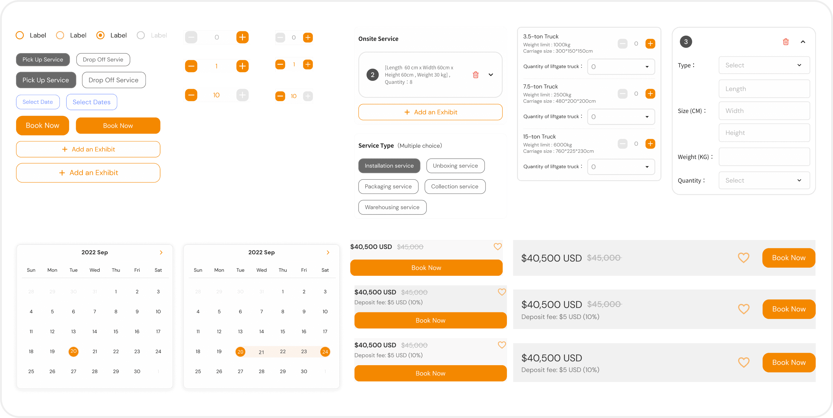
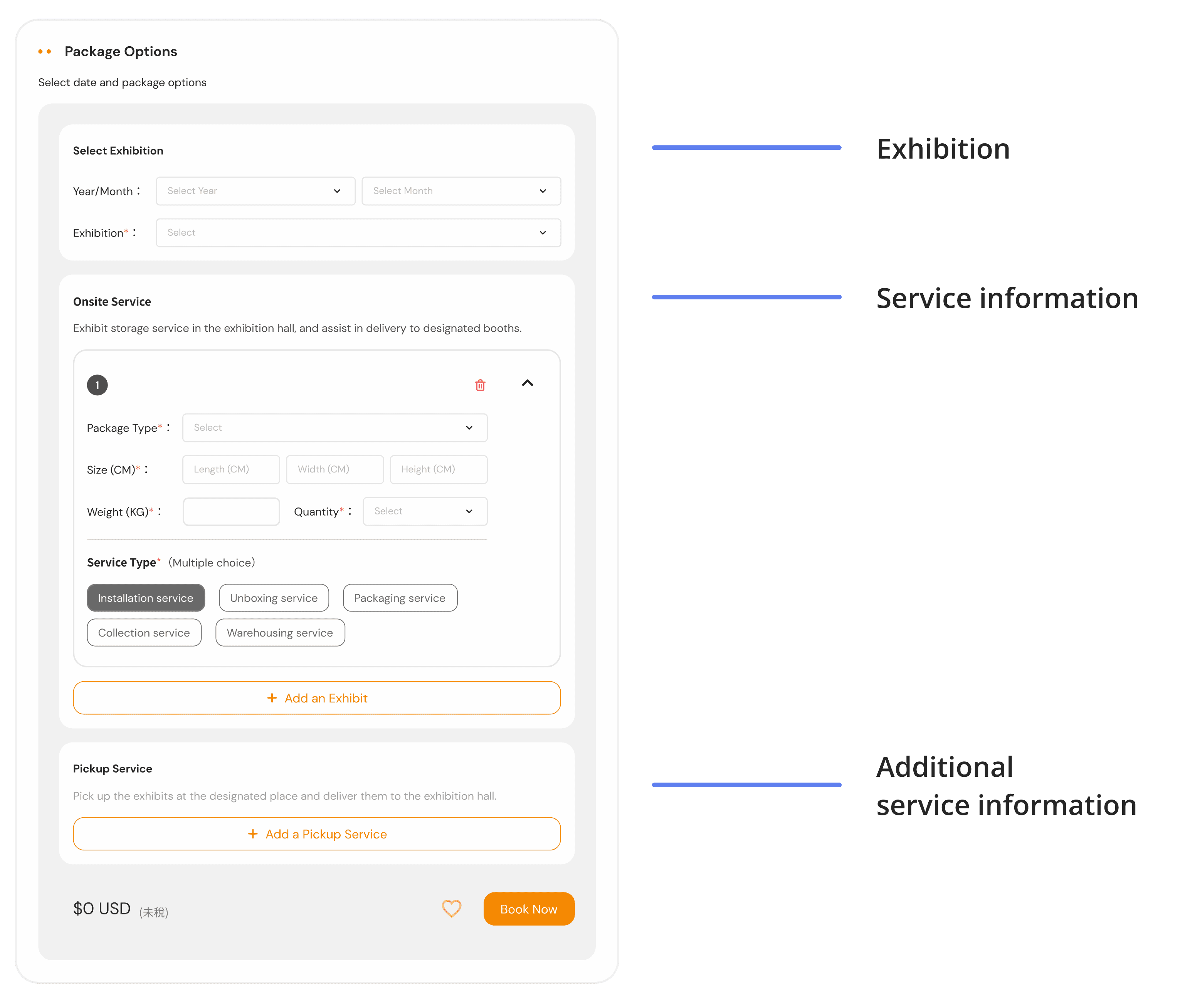
Create a grouped question to let users easy to place orders.
A good visual hierarchy could reduce customer efforts to complete orders. After understanding the relationship of the questions, I created a new layout, and it was divided into three sections.
Auto-collapse feature guides users to the next step.
The card will be auto-collapsed when users have filled the card. And users can expand and collapse the card anytime.


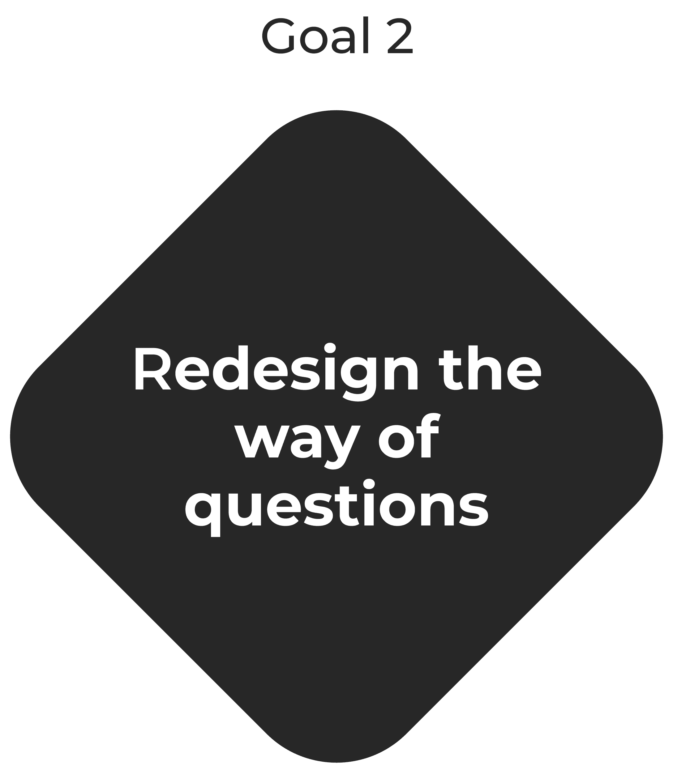
Redefine the question form to help customers complete the order smoothly.
I consulted with the PM from the service provider to understand the meaning of each question and the relationship between them.
Then, I put myself in the users’ shoes and rearranged the order of the questions to help them complete their order quickly.

Effective navigation helps users access information more easily.
A good navigation system could help users to access the information. Then I create the navigation through intuitive menus, obvious CTA buttons, and clear prices.

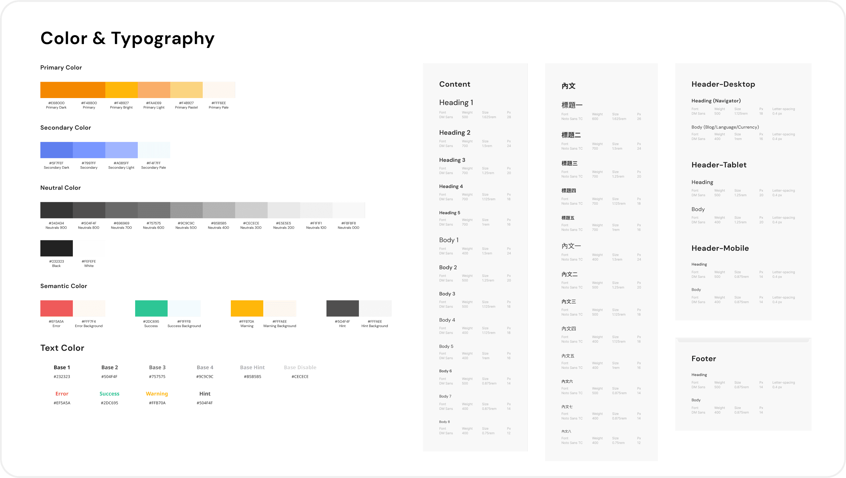
Users place orders smoothly on different device through visual consistency.
I ensure visual consistency across UI elements and redesign them for optimal user experience on different devices.
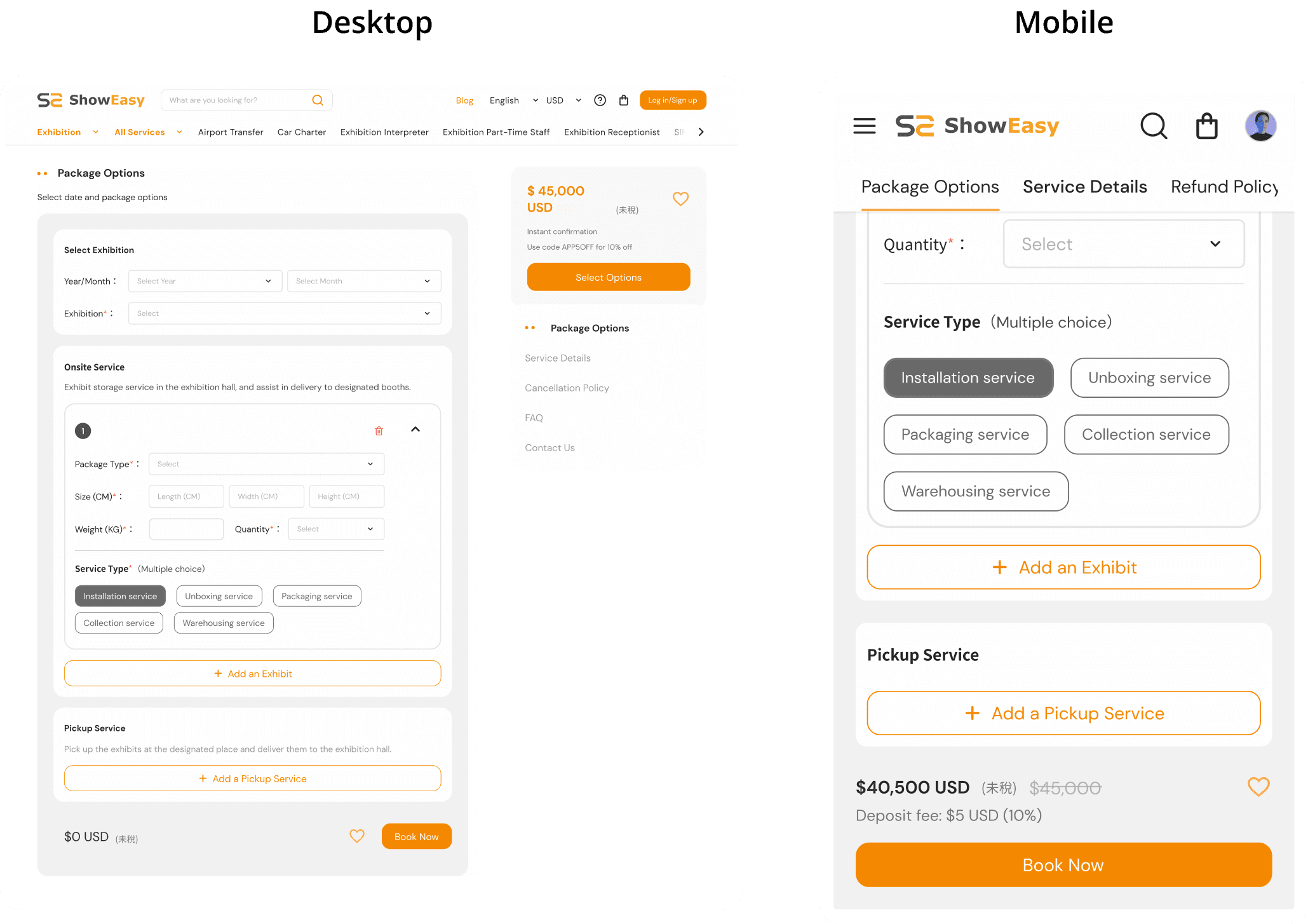

Streamline the checkout process through common UI elements.
When placing orders, familiarity with the interaction is key to speed.

So... what skills did I bring to this project?
Quick research skills
Critical thinking
Rapid prototyping and mockup skills
Cross function skills